Project
Represents a set of components configured according to specific requirements.
The following components are available for project configuration:
Pages
Layouts
Tabs
Modals
Sliders
Widgets
Pages
The page is a block that has the following components available:
Layout
Tabs
Modals
Sliders
Widgets
The configured page can be displayed in the navigation menu.
There can be as many pages in a project as needed.
Option | Description | Visualization |
|---|---|---|
Create Page |
| |
Name |
| |
Slug |
| |
Image |
| |
Active |
| |
Home Page |
| |
Edit |
|
|
Delete |
| |
Page order |
|

Layouts
The Layouts section is a space inside a Tab component.
When a Tab is created, widgets can be placed and configured in it.
There are two types of layouts:
Advanced Layout:
In an advanced layout, widgets are mostly aligned manually in the Studio using Non-Editing mode and the Configuration Working Area popup. The Configuration Working Area also allows setting:
Row Height
Margin
Columns
Making all widgets draggable (in Studio only)
Making all widgets resizable (in Studio only)
Making all widgets resizable in Clearion Web
Simple Layout:
In a simple layout, widgets are automatically aligned based on their type. For example, Navigation appears on the left side, the Toolbar is at the top, and the Map and Feature Table share space equally. In this layout, all widgets can be resized in the web application, except for the Navigation and Toolbar. The maximum number of resizable widgets per layout is four.
There is only one layout on each page.
Tabs
Tabs allow navigating between multiple sections of the page within a single window.
Each tab can represent a different section or content area.
During the creation of a tab it is possible to choose Name (required field), Description, Layout type, and Image
After adding a Tab, widgets can be added and configured.
Tabs created within a page are available on this page only.
There can be as many tabs on a page as needed.
Default tab conception
When creating a new page, a default tab named "Main" will be automatically generated

Parent-child tabs functionality
It is possible to create child tabs under each main tab. This setup can be a good alternative to using modal windows and sliders. The main tabs typically display a feature table, while each child tab contains a specific widget.
Records in the feature table can have two states:
Selected
Active
To work with widgets that are typically located in modals:
Click once on the checkbox to select a record.
Then, navigate to the child tab that contains the desired widget, such as Bulk Update, Query Widget, etc.
To work with widgets that are typically located in sliders:
Double-click the checkbox to activate a record.
After that, go to the child tab for the required widget, like Feature Attributes, Work Spans, Work Tasks, Close Work, etc.
Option | Description | Visualization |
|---|---|---|
Add a Tab |
| |
Tab Name |
| |
Tab Description |
| |
Layout type |
| |
Right Side % |
| |
Preserve Splitter Position |
| |
Tab image |
| |
Role |
|
|
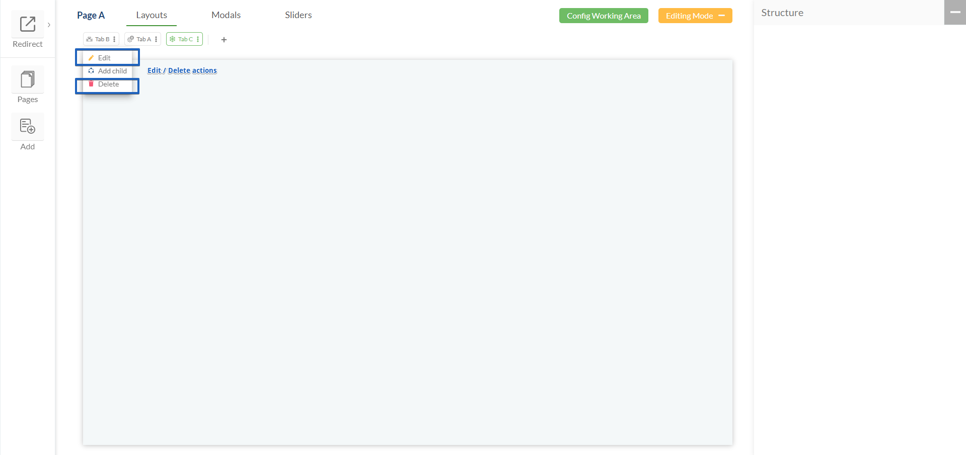
Edit |
|
|
Delete |
| |
Add a child tab |
|
|
Collapse and expand the child tabs list |
|
|
Tabs order |
| |
Add a Widget |
| |
Configure a Widget |
|
|
Delete a Widget |
|
.png)
.png "image(116).png")
.png "image(117).png")

Modals
The Modals section is a space where a Modal component can be created.
When a modal is created, a widget can be placed and configured in it.
Content placed in the modal is available to Clearion Web users via toolbar buttons.
Modals created within a page are available on this page only.
There can be as many modals on a page as needed.
Option | Description | Visualization |
|---|---|---|
Add a new Modal |
| |
Add a Widget |
| |
Configure a Widget |
|
|
Delete a Widget |
|

Slider
The Sliders section is a space where a Slider component can be created.
When a slider is created, a widget can be placed and configured in it.
Content placed in the slider is available to Clearion Web users via double-clicking on an entry in the table since the information in the slider directly relates to a specific table entry.
Sliders created within a page are available on this page only.
There can be as many sliders on a page as needed.
Option | Description | Visualization |
|---|---|---|
Add a new Slider |
| |
Add a Widget |
| |
Configure a Widget |
|
|
Delete a Widget |
|
