Feature Attributes widget
Serves to configure a panel that displays a detailed view of the attributes of a specific feature from a specific feature table.
Feature Attributes widget configuration
Field | Description | Visualization |
|---|
Name | | Field in Studio Visualization in Clearion Web |
Add Group | Group Settings: Title - sets group title Collapsed By Default - the user can configure field groups to be collapsed by default Fields can be added manually via Add Column Fields can be added automatically via Generate Columns:
Fields Settings: Header Text - any text that represents a column name can be added Field - should correspond to a field in a table Type - text, date, number, lookup, date, number, URL Field Mask - ensures users enter values for Phone and ZIP code fields in the correct format Allow Clear Option - The option to clear fields is configurable and can be toggled on or off Numeric Format - allows user to choose a specific way to display values of numeric fields. There are 3 available numeric formats:
Integer - X (a rounded number) Float - X.X ( for example- 1.2, 11.5, 10.0) Double Precision - X.XX (for example- 3.30, 0.00, 5.50)
Is Async Search Field - if the checkbox is enabled, the associated input field will not display any dropdown options until the user begins typing. As the user types, options dynamically corresponding to the entered text will be presented in a dropdown list. Important Considerations: This option is not applicable to static lookups or number type fields. For table lookups, the values displayed in the dropdown will be drawn from the "Value" field as configured in the Table Lookup settings, rather than from the currently active input field. Enabling this feature significantly optimizes lookup performance, especially when dealing with large datasets.
For example: When the number of columns = 1 1/1 grid column - Default, ‘1’ is where the column starts and ends. grid will look the with 2/1 or 1/2 grid columns 1/3 grid column - ‘1’ is where the column starts and ‘3’ is where the column ends 2/4 grid column - 2 columns are being created, and the field will be placed on the right column (grid column starts in 2 and ends in 4)
When the number of columns = 2 1/1 grid column - Grid will have 2 columns, and the field will be placed in the right column 1/4 grid column - Grid will have 3 columns, and the edited column will be placed at the bottom of the whole grid 3/5 grid column - Grid will have 4 columns, and the edited column will be placed at the bottom on the right side of the grid
| Adding Groups and Fields
Grid Column 1/1
Number of columns = 1 .png "Screenshot 2024-09-27 162905(1).png")
Grid Column 3/5
Number of column = 2.png "Screenshot 2024-09-30 114811(1).png") Collapsed By Default .png)
Allow Clear Option .png)
|
Related Layers | Determines which additional tables should contain changes applied to a current feature (record) Tables should be initially added to a Data Source > Feature Tables to be displayed in the Related Tables dropdown
| |
Number Of Columns | | |
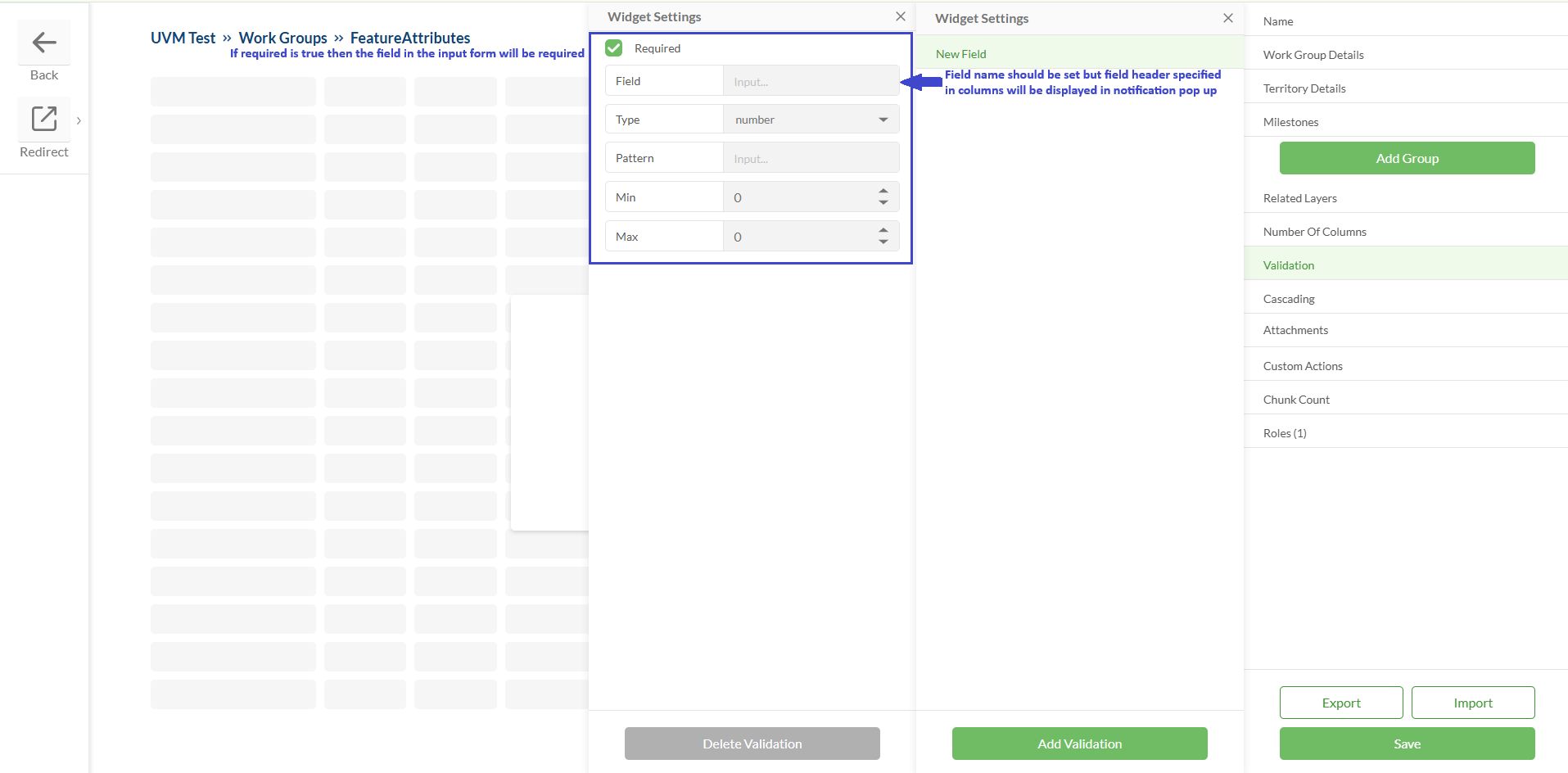
Validation | Allows to configure validation for the fields Required fields should be specified Required fields types should be specified Validation of numeric fields supports patterns (regex) in addition to min/max values
| 
|
Cascading | The cascading fields feature enables certain fields to appear in the Feature Attributes form based on the selection in a trigger field For example: If the Status field is set as the trigger and its value is set to "1", this will prompt the 'Notes' field to appear. In this case, choosing Status 1 activates the cascading effect, displaying the 'Notes' field for additional input.
| 
|
Custom Actions | | |
Attachments | | |
Chunk Count | A configurable chunking system to enhance performance and scalability. The chunks count system determines how many data chunks are loaded from the server, reducing client-side load. The number of features per chunk is controlled by server settings. This option is configurable via the widget settings form:
| .png)
|
Roles | Allows to set up field configuration for different project roles. Field visibility, read-only status, field type, lookup, etc. could be changed for user groups with different access levels inside the same widget.
| .png)
.png)
|
Save | | |
Export / Import | | |
Configured widget preview
Studio
Clearion Web


.png "image(18).png")

