Feature Table
In terms of a portal, it refers to a tabular data structure that contains attribute information associated with geographic features. These features can be points, lines, or polygons representing real-world entities such as buildings, roads, or parcels.
Feature Table widget
It is a table that displays data from the portal and also contains settings that expand the functionality of the portal table.
Feature Table widget configuration
Field | Description | Visualization |
|---|
Name | | .png)
|
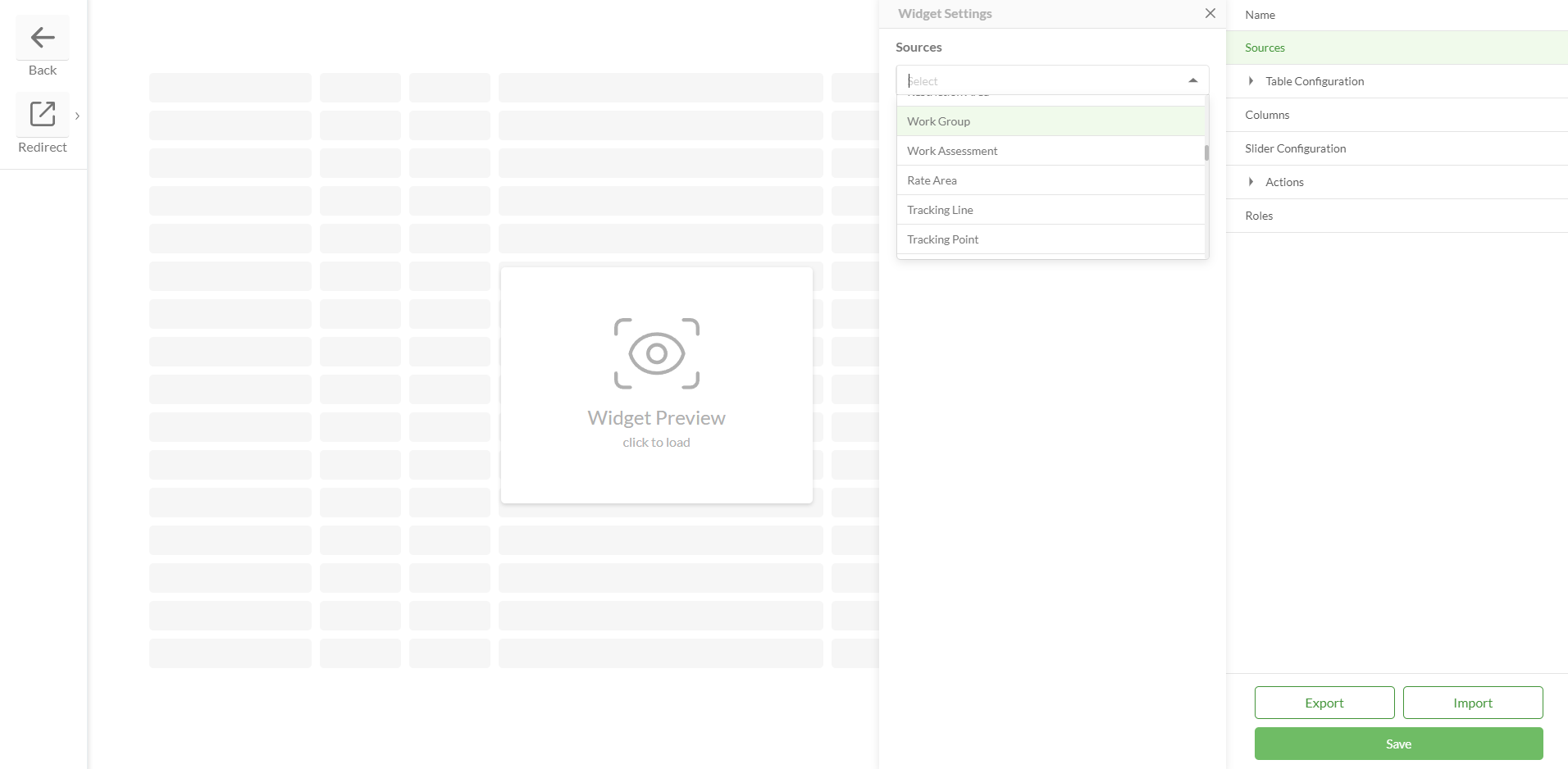
Sources | Sources represent a portal table or tables the data of which will be displayed in the Feature Table widget Source table should be initially added to a Data Source > Feature Tables to be populated in the Source dropdown
| 
|
Table Configuration | Query Parameters Where - query which filters records that will be displayed in the table Order By Fields - determines the order of the feature table entries Return Geometry - determines whether or not spatial information (the geometry) associated with geographic features will be included when querying or retrieving data from a table
| 
|
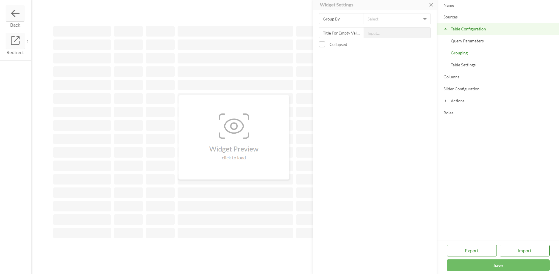
Grouping Group By - groups table records by a specified field Title For Empty Values - if the field by which grouping is enabled has empty values, this setting allows to group them into one category with a specific name Collapsed - if true then grouped records are collapsed by default
| 
|
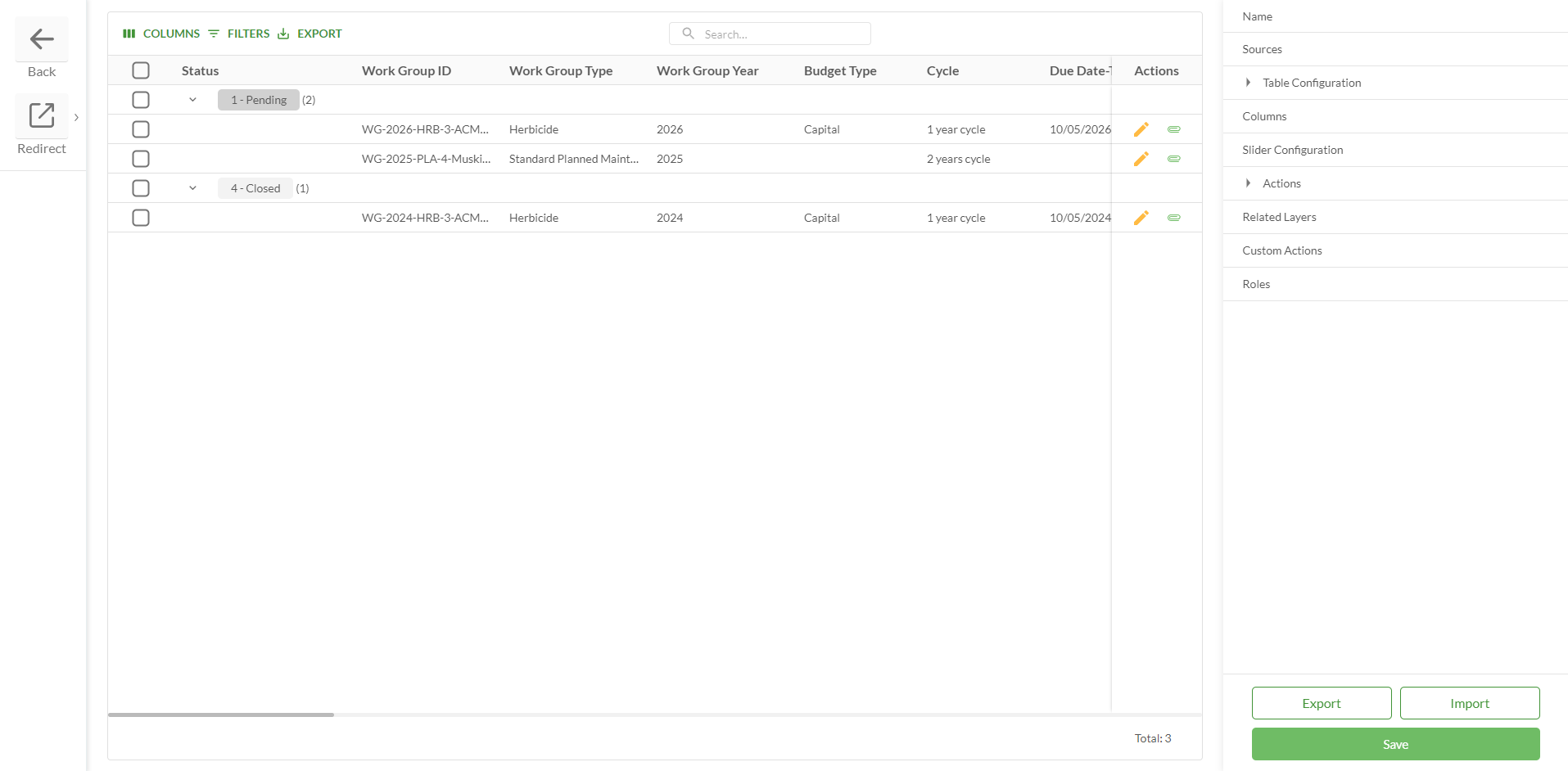
Table Settings Sorting - displays a button at the header of each column to sort table records Filtering - displays a menu that allows to filter by table records Search - displays a menu that allows to search through table records Column Selection - displays a menu that allows to show and hide columns Pinned Selection Rows - the checkbox column is pinned to the left when scrolling horizontally, ensuring selection controls remain accessible Export - allows to export data into an Excel spreadsheet Paging (Page Size) - if true, then it is possible to set the default amount of records per page Show Table Name Column - if there’s more than one source for the Feature Table, then it is possible to display the Table Name column that will determine which entry comes from which table Loading Table Data - allows to limit the loading of data in the Feature Table until the query is created Save Filter Data - if true then applied filter parameters are preserved when navigating the pages till the page is reloaded or filter parameters are reset Preserve Table State - the state of the reorganized tables can be preserved when the user navigates between tables: Reordering Sorting Pinning Grouping Hiding Pagination Filter Search Groups collapse/expand
Enable Pivot Table - pivot functionality allows users to reorganize and summarize data dynamically, transforming detailed row-based data into a cross-tabular view Chunk Count - a configurable chunking system to enhance performance and scalability. The chunks count system determines how many data chunks are loaded from the server, reducing client-side load. The number of features per chunk is controlled by server settings. This option is configurable via the widget settings form:
| .png)
Pivot table feature.png) |
Columns | Represent fields from the source table Checkbox is a default column Columns can be added manually via Add Column Columns can be added automatically via Generate Columns:
Column Settings: Header Text - any text that represents a column name can be added Field - should correspond to a field in a table Width - can be set any appropriate width. If set to 0 then the width will be automatically adjusted Lookup - lookup should be added if this is a lookup field URL Type - if the field represents a URL then it can be displayed as a Link or Button Sign - if selected, displays a sign near the value in the cell Numeric Format - allows user to choose a specific way to display values of numeric fields. There are 3 available numeric formats: Integer - X (a rounded number) Float - X.X ( for example- 1.2, 11.5, 10.0) Double Precision - X.XX (for example- 3.30, 0.00, 5.50)
Field Mask - ensures users enter values for Phone and ZIP code fields in the correct format Visible - determines if the column is visible or hidden by default. If hidden it can be selected in Columns Selection menu (if it is enabled) Readonly - determines if this column will be editable when the Inline Editing action is enabled Add Theme Config - allows to select a color for a field. Colors should be created in advance on the Themes page. Widget preview should be loaded to display Theme configuration settings Hide Time For Date Fields - when checkbox is selected, the time in the date fields is being hidden, and only the date is visible
| Add Column .png)
Generate Columns 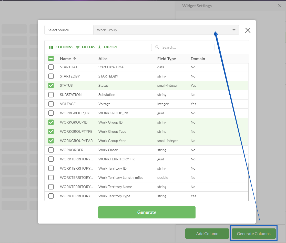
Column Settings .png)
|
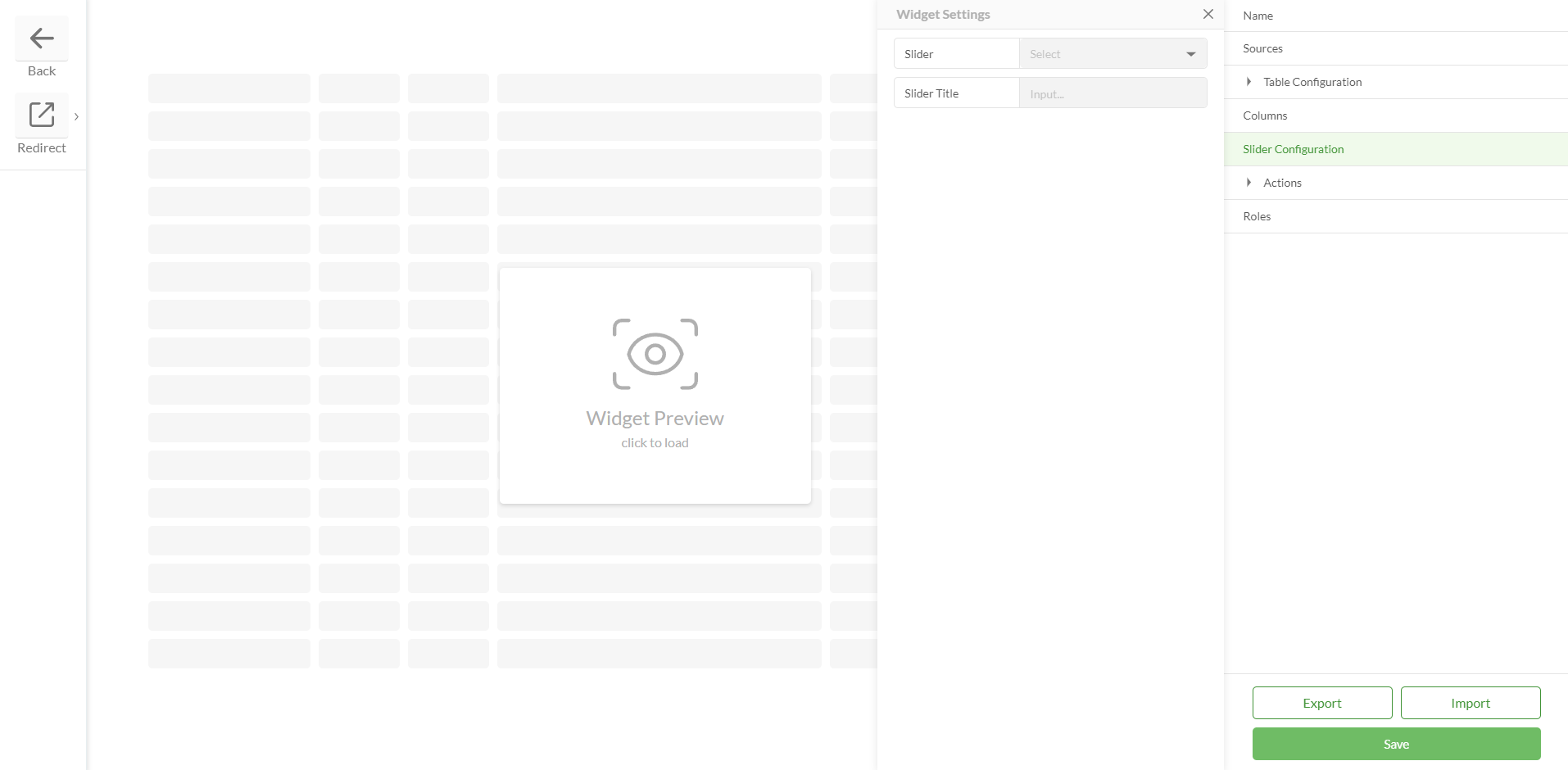
Slider Configuration | Slider ID Slider is an element that is shown when double-clicking on the table record (e.g. Feature Attributes widget can be placed in a slider) Slider should be created in advance and specified for a table in the Slider ID field
| 
|
Slider Title Field The slider title determines whether a title will be set for a sider The slider title can be empty or it can display information from a specific field To display information from a specific field this field must be selected in the Slider Title Field
|
Actions | Table Actions Enables and disables Inline Editing options Allow Add Allow Edit Allow Delete Allow Edit Attachments
When any feature from the settings is active, it becomes accessible to both Studio and Web users
| .png)
.png)
|
Allow Add Add New Record Fields Add New Record / Edit Record Validation |
Allow Edit |
Allow Delete |
Allow Edit Attachments |
Related Layers | | 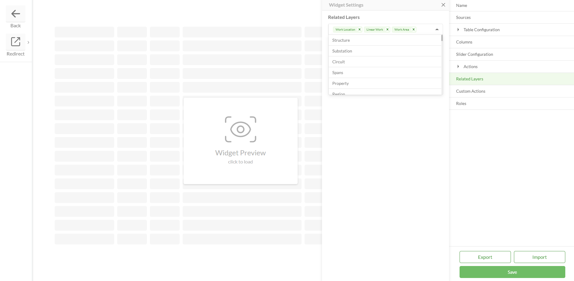
|
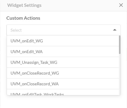
Custom Actions | If the Allow Add action is enabled then this field is visible If any additional actions need to be performed when adding records to the table, they should be created and added here
| 
|
Roles | Allows to set up field configuration for different project roles Field visibility, read-only status, field type, lookup, etc. could be changed for user groups with different access levels inside the same widget Allows to manage Add/Edit/Delete rights for every Role Any Where Clause can be set up for each Role separately. Therefore, each Role will be able to see only the corresponding data
| 
|
Save | | 
|
Export / Import | |
Configured widget preview
Studio