Related Table Widget
Represents an ArcGIS Feature Table that contains attribute data that is associated with the features in the specific feature layer.
In terms of a portal, it refers to a tabular data structure that contains attribute information associated with geographic features. These features can be points, lines, or polygons representing real-world entities such as buildings, roads, or parcels.
Compared to a regular Feature Table widget, the functionality of the Related Table is limited.
Related Table configuration settings
Field | Description | Visualization |
|---|
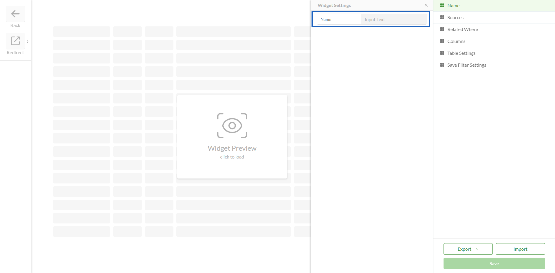
Name | | Field in Studio Clearion Web visualization |
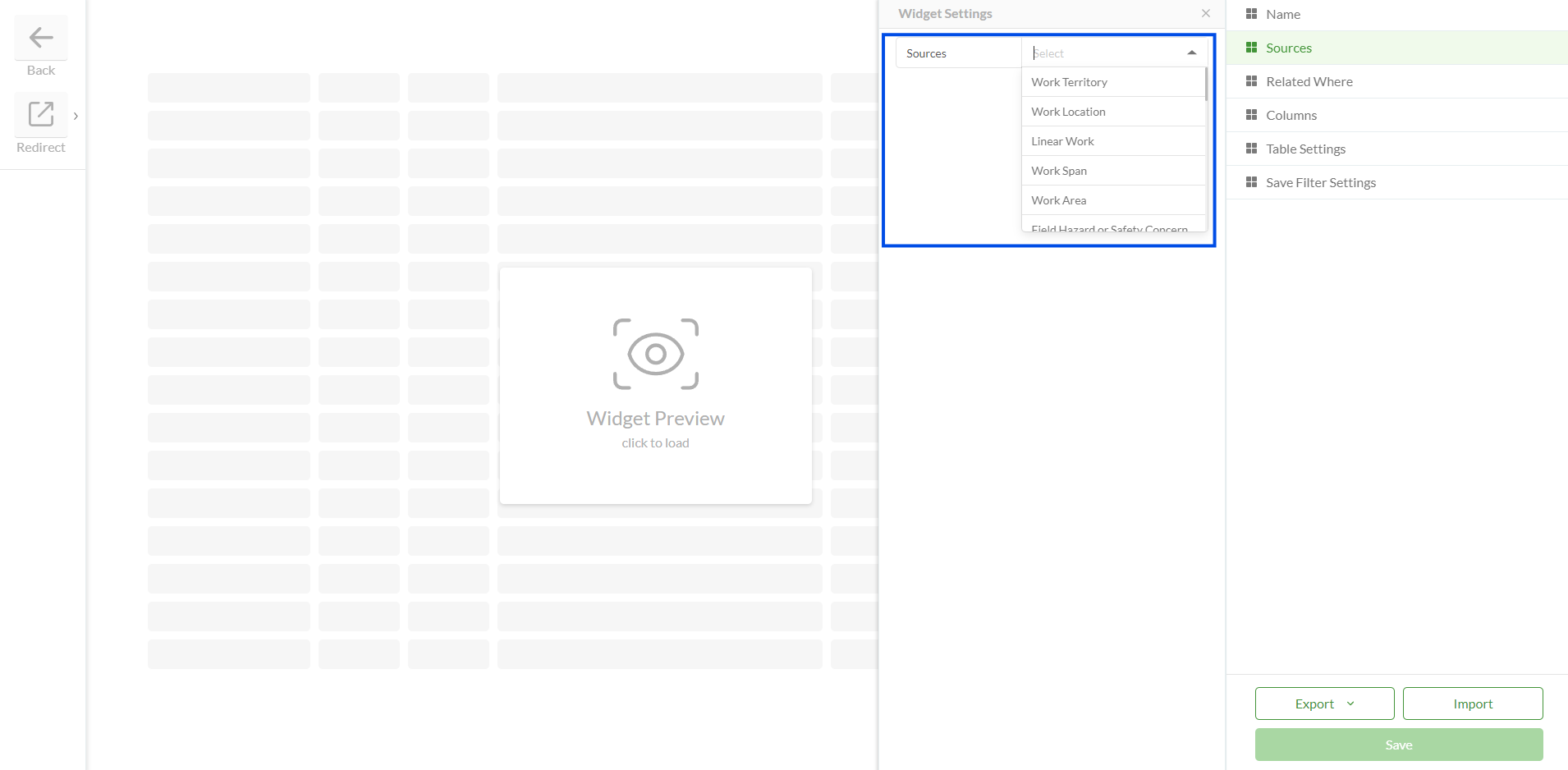
Sources | Source represents a portal table or tables the data of which will be displayed in the Related Table widget Source table should be initially added to a Data Source > Feature Tables to be populated in Source dropdown
| |
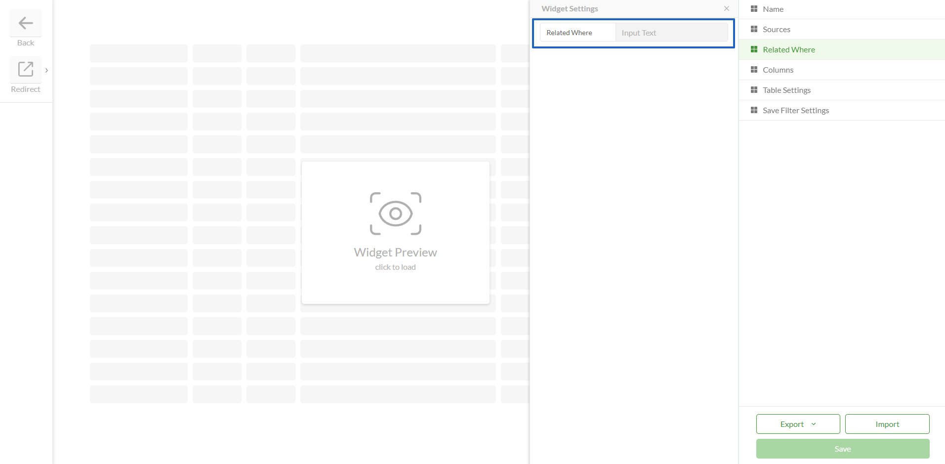
Related Where | | |
Columns | Settings: Header Text - can be added any text which represent a column name Field - should correspond a field in a table Width - can be set any appropriate width. If set to 0 then width will be automatically adjusted Lookup - lookup should be added is this is a lookup field URL Type - if the field represents a URL then it can be displayed as Link or Button Sign - if selected, displays a sign near the value in the cell Numeric Format - allows user to choose a specific way to display values of numeric fields. There are 3 available numeric formats: Integer - X (a rounded number) Float - X.X (for example- 1.2, 11.5, 10.0) Double Precision - X.XX (for example- 3.30, 0.01, 5.50)
Visible - determines if column is visible or hidden by default. If hidden it can be selected in Columns Selection menu (if it is enabled) Add Theme Config - allows to select a color for a field. Colors should be created in advance on the Themes page. Widget preview should be loaded to display Themes configuration settings
| Add column
Generate columns
Colors configuration
|
Table Settings | Enables or disables specific options for a table which will be available for Web users: Show Zoom And Highlight - allows to show or hide Zoom And Highlight buttons for the widget Allow Edit - Adds a button to the Related Table, allowing a related table record to be edited by clicking on it. Read-only columns will not be editable Sorting - displays a button at the header of each column to sort table records Filtering - displays a menu that allows to filter by table records Search - displays a menu that allows to search through table records Grouping - displays button which allows to group a table by some fields Column Selection - displays a menu that allows to show and hide columns Pinned Selection Rows - the checkbox column is pinned to the left when scrolling horizontally, ensuring selection controls remain accessible Export - allows to export data into an Excel spreadsheet Paging (Page Size) - if true then it is possible to set the default amount of records per one page Preserve Table State - the state of the reorganized tables can be preserved when the user navigates between tables: Reordering Sorting Pinning Grouping Hiding Pagination Filter Search Groups collapse/expand
| |
Save Filter Settings | | |
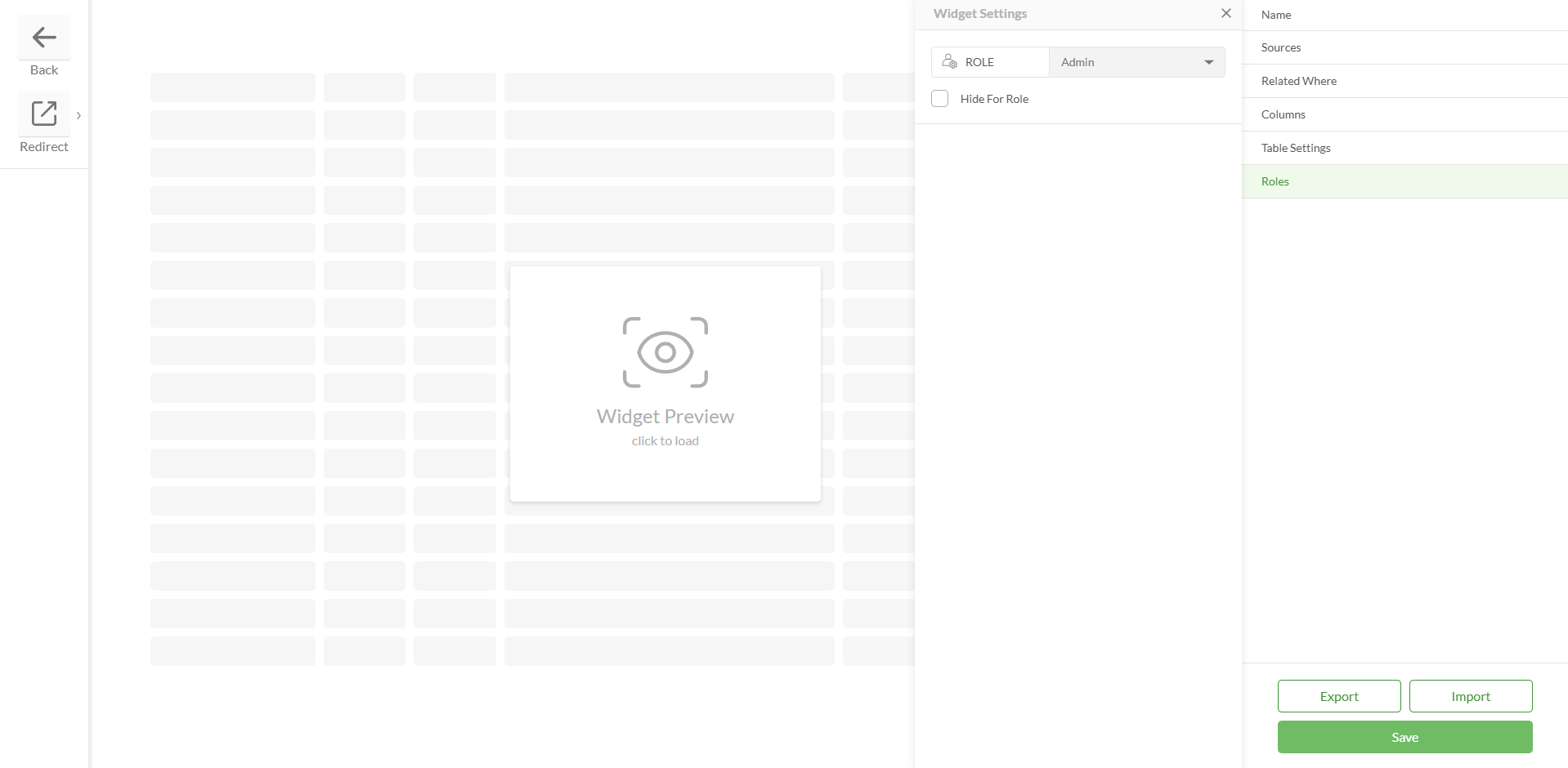
Role | Allows to hide the widget for the selected role If all Slider widgets are hidden for a particular role, the Slider itself will be hidden for that role
| 
|
Spatial Buffer | An option enables the ability to apply a spatial buffer when retrieving related features. Configuration parameters: Buffer – buffer distance (numeric value) Unit – unit of measurement (e.g., meters, kilometers) Spatial Relationship – choose between "intersects" or "contains" Combine Spatial Buffer With Where – option to combine the spatial filter with a standard where clause
Supported spatial relationships: This behavior is available as a configurable option, allowing projects to enable or disable it based on their needs | .png)
|
Custom Actions | If the Allow Edit action is enabled, then this field is visible If any additional actions need to be performed when editing records, they should be created and added here
| .png)
|
Save | | |
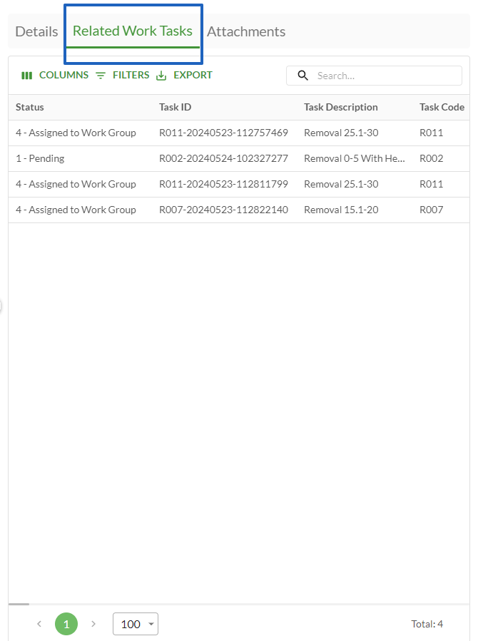
Configured widget preview
Studio
Clearion Web
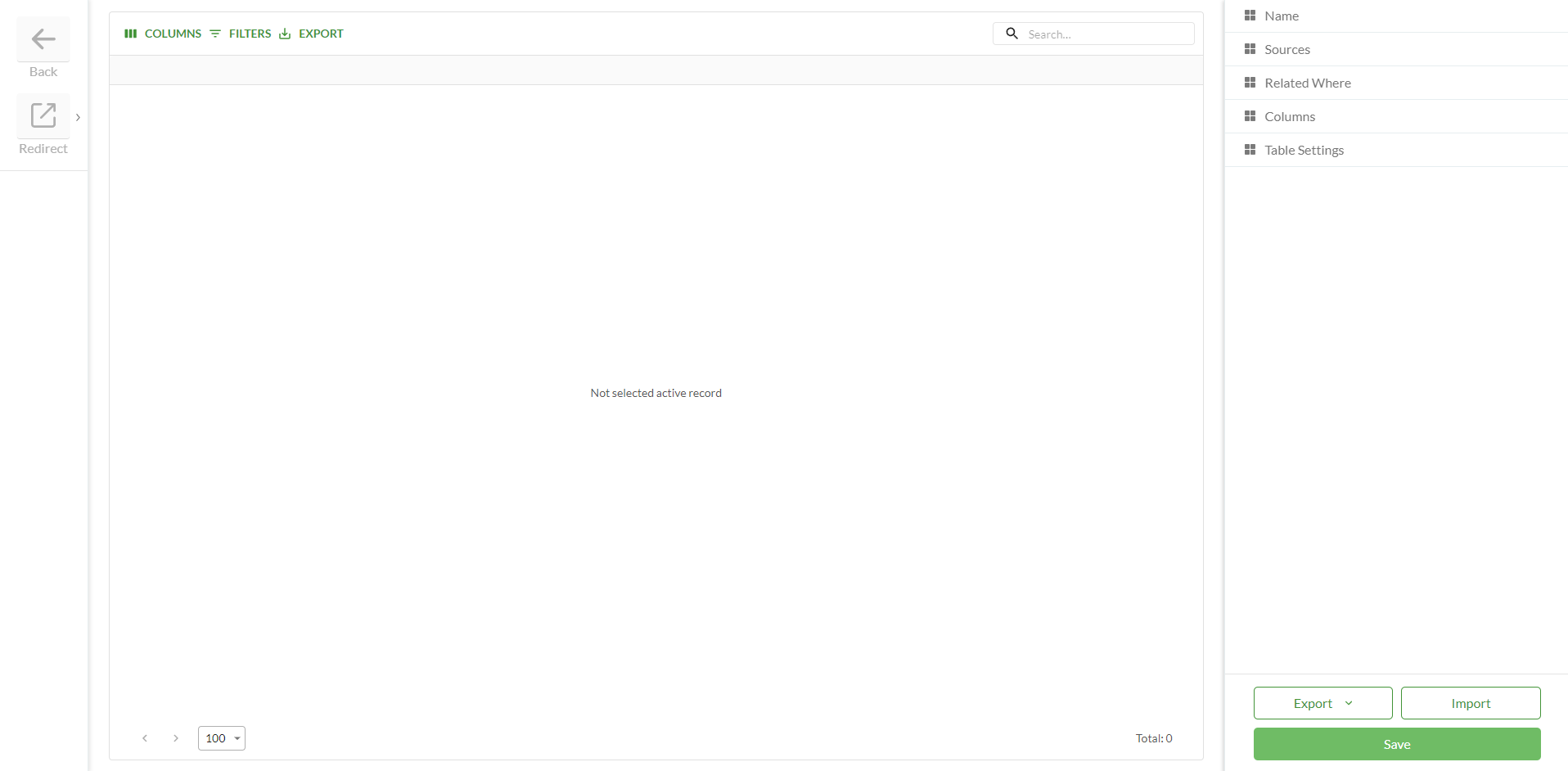
.png)
.png)
.png)

.png)
.png)
.png)