This guide provides a step-by-step walkthrough on how to configure a new project, starting with fundamental prerequisites and concluding with the final page setup, covering everything a user needs to create a new project from scratch.
How to create groups
Entities such as Data Sources, Lookups, Custom Actions, Roles, and Themes are organized within Groups. These Groups are typically configured to mirror specific project environments. For example, a Test Group contains test-specific entities for a Test Project, while a Prod Group contains prod-ready entities for a Prod Project.
Press the groups tab (below Entities)
Press the ‘x’ button
.png)
3. Fill in the Name and Description (if needed) fields, and then press ‘Save’
Applying a group to an entity
Entities must be assigned to a Group during the initial creation process via the first row of settings. Please note that Groups cannot be retroactively applied to an existing entity 'from scratch' once it has been created
Choose an entity (lookup, data source, custom action, etc.)
Ensure that all required fields are filled in (Table key, field name, source, etc.).
Select a group from the groups lookup
.png)
Reference link*
*The reference link provides a deep dive into the different entities and widgets described in the article, in an external article
How to create data sources
Tables:
There are two ways to create tables:
1. From Portal:
After clicking the ‘+’ button, press ‘From Portal’
Select a feature service, and the group(s) that the table(s) will be included in
Select a table (or tables) that will be created
Press ‘Add’
.png)
2. Manually:
Fill all the required fields on the Properties tab
Make sure that all of the input data corresponds to the table’s data on the portal
After filling in all data on the Properties tab, review the configured table on the Data tab to ensure that it’s configured correctly
Press ‘Save’
.png)
.png)
Reference link
Adding Maps:
Enter the Maps tab
Press the ‘+’ button
Fill the Groups, Name, Key, and Map ID fields (all fields are required)
Ensure that the map key and ID match the values on the portal
Press ‘Save’
.png)
Reference link
Adding Services:
Enter the Services tab
Press the ‘+’ button
Fill the Groups, Name, Key, Service ID, Use Server (True or False), and portal fields (Service URL field isn’t required)
Press ‘Save’
.png)
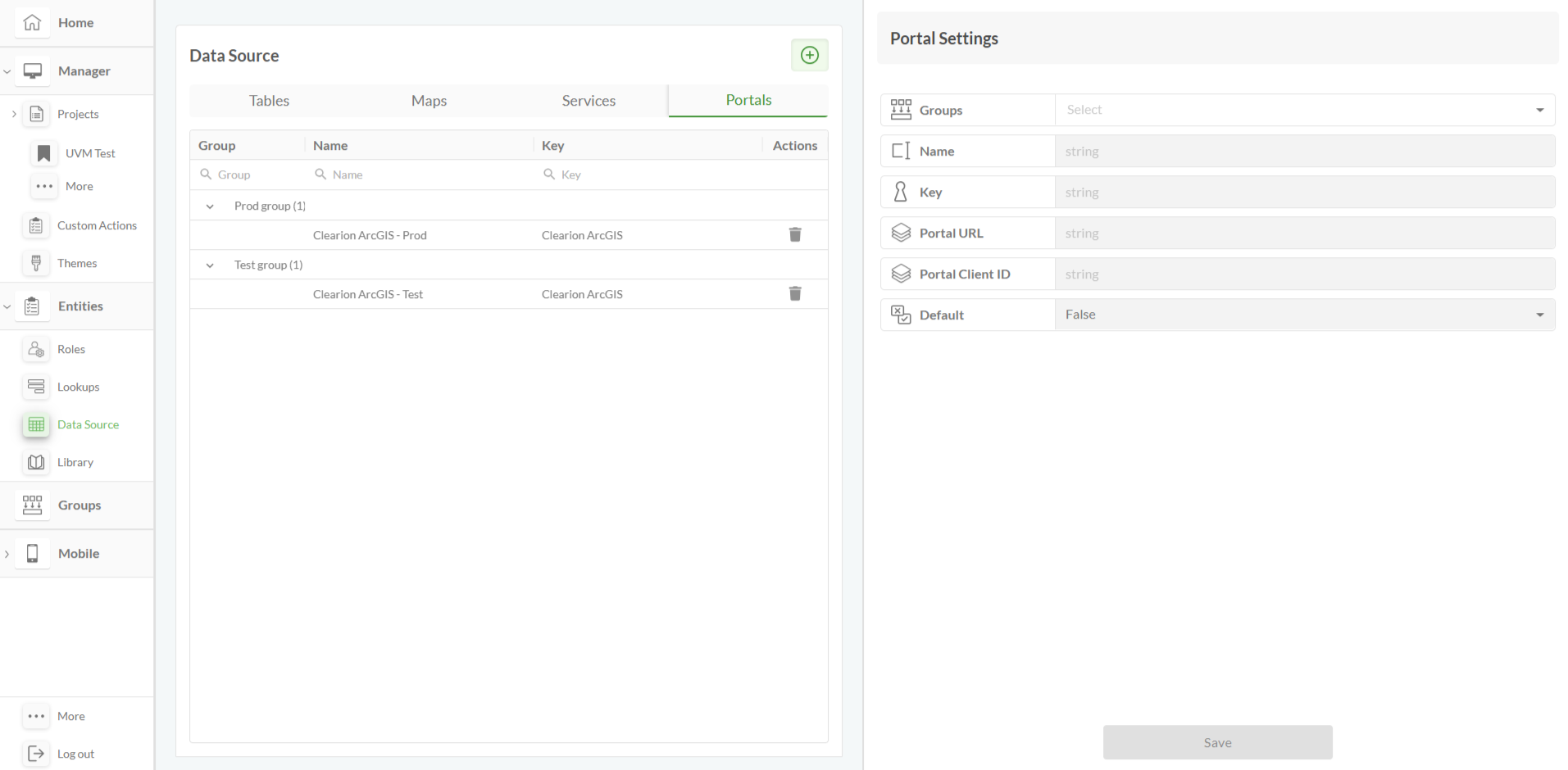
Adding Portals:
Enter the Portals tab
Press the ‘+’ button
Fill the Groups, Name, Key, Portal URL, Portal Client ID, and Default (True or False) fields
Press ‘Save’
How to create projects
Head to the Projects List
Name the newly created project, and choose a data group that the project will be included in
Press ‘Save’
The entered data can be edited by pressing the pencil icon
The project can be added to the favorites by pressing the star icon
.png)
.png)
Reference link
How to create pages
Pages are project-specific because they contain unique data. Consequently, you must create a project before you can begin adding pages to it
Select a project where the pages need to be created
Press the ‘Pages’ button to the left of the page
Press the ‘+’ button
On the ‘Create New Page’, fill in the Name, Slug, and Image fields.
Set the Active field to ‘true’ to make the page visible on Clearion web. The page can be set to be the home page by setting the Home Page field to true
Press ‘Save’
.png)
.png)
Reference link
How to add a map and its settings
The Map and its settings are basic elements of a standard (together with the feature table and the navigation bar). The displayed features in the FT will be visibly shown on the map, as long as they have a geometry (e.g., Work Assessments, Work Groups, Worksites)
Press the ‘Add’ button on the left on the page (below pages)
Select the map widget
Resize the map as desired using the arrow on the bottom right of the widget
To enter the map settings:
Go to the widget list on the top right of the page (Under the ‘Structure’ title)
Press the pencil icon
A list of settings will be shown to the right of the page, featuring: The Name, Source, Modules, Zoom, Map visibility settings, and Roles
An expanded list of settings will be displayed after selecting one from the initial list
.png)
.png)
Reference link
Navigation bar + toolbar elements
Press the ‘add’ button to the left
Select the Navigation and toolbar widgets
Resize the widgets as desired using the arrow on the bottom right of the widget, and move them by pressing & dragging to the desired location
The Navigation and Toolbar widget can be edited using the widget settings
.png)
.png)
Reference link
Reference link
Toolbar elements: zoom, highlight, query widget
Zoom widget:
Enter the toolbar widget settings, and press the menu column
Press ‘Add Item’
Fill in the Text and Icon fields (usually the widget is named ‘Zoom’, and there is a designated icon named ‘Zoom’/’Zoom V2’)
In the ‘Action’ field lookup, select ‘ZOOM’
Check the Is Visible field to true, to make the widget visible
Check the Requires Selected Records field to true, to activate the zoom action only for specified records
Press ‘Save’
.png)
Highlight widget:
Enter the toolbar widget settings, and press the menu column
Press ‘Add Item’
Fill in the Text and Icon fields (usually the widget is named ‘Highlight’, and there is a designated icon named ‘Highlight’/‘Highlight V2’)
In the ‘Action’ field lookup, select ‘HIGHLIGHT’
Check the Is Visible field to true, to make the widget visible
Check the Requires Selected Records field to true, to activate the highlight action only for specified records
Press ‘Save’
.png)
Query widget:
Enter the ‘Modals’ tab, and ensure that editing mode is on
Press ‘Add New Modal’, and name the modal
Press the add button to the left of the screen, select ‘Query’, and resize the widget as desired
Press the created query on the modals list to the right of the screen, then press the arrow on the left of the column, and enter the widget settings
Add all the necessary data to the query (fields, target container, tab order, etc.), and press ‘Save’
Return to the layouts tab, and press the ‘Menu’ column on the toolbar widget settings
Press ‘Add Item’
Fill in the Text and Icon fields (usually the widget is named ‘Query’, and there is a designated icon named ‘Query’/‘Query V2’)
In the ‘Action’ field lookup, select ‘OPEN_MODAL’, and select the recently created query modal
Check the Is Visible field to true, to make the widget visible
Press ‘Save’
.png)
.png)
.png)
Reference link
FT > the slider (FA)
To add a Feature Table (FT):
Press the ‘Add’ button to the left of the screen, and select the FT widget
Resize the FT, ensuring that all widgets fit inside the page
Add all the necessary data to the FT using the widget settings (sources, columns, table configuration, etc.)
Press ‘Save’
.png)
.png)
Reference link
To add Feature Attributes (FA):
Enter the ‘Sliders’ tab
Press ‘Add New Slider’, and name the widget as desired
Press the ‘Add’ button to the left of the screen, select the FA widget, and resize the widget as desired
Press the created slider on the sliders list to the right of the screen, then press the arrow on the left of the column, and enter the widget settings
Add groups, and then all the necessary data to the FT using the widget settings (Name, Fields, Related Layers, etc.)
Press ‘Save’
Return to the Layouts tab, and enter the FT widget settings
Press the ‘Slider Configuration’ column, and select the recently created slider in the slider field
Add a title to the slider if desired
.png)
.png)
Reference link
Notes for the user
Entities (Roles, Lookups, Data Source, Library) - Can be created on the entities tab and applied via the widget settings
.png)
Reference link
Custom Actions - can be created on the ‘Custom Actions’ tab and applied to widgets and tabs via the ‘Custom Actions’ column. Pay Attention - when copying/merging CAs from test app to prod app (or vice versa), make sure that layers’ names/IDs match the corresponding data sources
.png)
Reference link
Themes - can be created on the ‘Themes’ tab, and applied to fields via the widget settings. Pay attention - each theme can be applied to a single value, and the ‘Widget Preview’ square in the middle must be pressed before applying the theme
.png)
Reference link
Adding tabs (to the same page) can be done by pressing the ‘+’ button in the top-left corner, next to the ‘Main’ default tab. The tabs can be edited, deleted, and have child tabs added to them by pressing the three dots
.png)
Reference link
Adding Related Tables & Close Work tabs - can be done by navigating to the Sliders tab (next to the modals tab), and selecting the widget from the ‘Add’ page (below ‘Pages’). The order of the tabs can be changed by dragging them within the ‘Slider’ dropdown. Make sure that the slider is created before the addition of the tabs, and select the proper data source for each widget
.png)
Reference links
When cloning/merging projects - When copying/merging from test app to prod app (or vice versa), make sure that the layers’ names/IDs, lookup names, match the corresponding data sources in the following entities:
Dynamic Lookups
Custom Actions